Monday to Saturday - 8:00 -17:30
Designing Effective Guide Signs: Fonts, Colors, and Layout Tips
Guide signs play a crucial role in directing traffic and improving road safety, but their effectiveness depends heavily on good design. A well-designed guide sign communicates quickly and clearly—especially when drivers have only seconds to read and react.
In this article, we break down the key elements of designing guide signs that are not only functional, but also compliant with industry standards.
1. Font Selection for Readability
Font choice directly impacts how quickly a sign can be read from a distance.
✅ Recommended Fonts:
-
Highway Gothic (FHWA Series): Widely used on U.S. road signs
-
Clearview: Optimized for legibility under different lighting conditions
-
Arial / Helvetica: Common in private or campus settings for modern readability
🔍 Font Tips:
-
Use uppercase for short messages, mixed-case for longer ones
-
Avoid decorative or script fonts—they reduce clarity
-
Ensure consistent letter spacing and avoid overcrowding
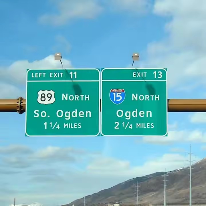
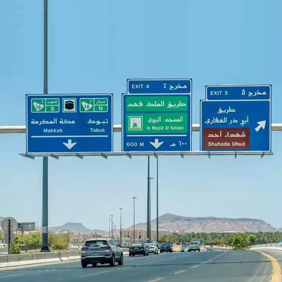
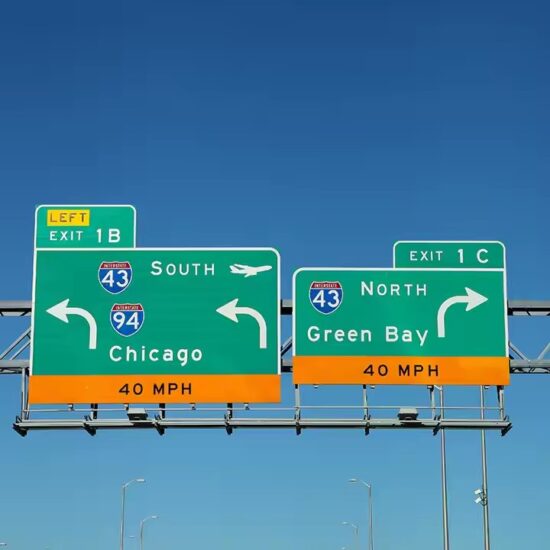
2. Color Guidelines for Visibility and Compliance
Colors are more than visual preferences—they’re regulated to convey specific meanings.
🚦 Standard Color Schemes:
-
Green background + White text → General directional guide signs
-
Blue background + White text → Services (gas, lodging, food)
-
Brown background + White text → Recreational or cultural sites
🌗 Tips for Color Use:
-
Ensure high contrast between text and background
-
Avoid using too many colors—simplicity increases clarity
-
Use reflective materials to maintain visibility at night or in bad weather
3. Layout & Spacing Principles
The layout determines how easily the message is processed at a glance.
📐 Layout Best Practices:
-
Use left-aligned text for multiple lines—more natural for eye scanning
-
Maintain adequate spacing between lines and icons
-
Include directional arrows that match driver expectations (e.g., right turn arrow on the right side)
🔳 Visual Hierarchy:
-
Prioritize important words (e.g., destination names) with larger fonts
-
Use symbols to support text when helpful (e.g., hospital “H”, gas pump icon)
-
Limit each sign to one main idea to reduce cognitive load
4. Size and Distance Considerations
Size directly affects how far away a sign can be read.
📏 General Sizing Rule:
-
For road signs: 1 inch of letter height = 30–40 feet of legibility
-
Example: A sign with 6″ letters is readable from about 180–240 feet
For high-speed roads or highways, use larger signs and longer mounting distances to ensure adequate reaction time.
5. Material and Reflectivity
Design must be supported by durable and visible materials.
-
Use retroreflective sheeting to enhance night visibility
-
Choose weather-resistant substrates like aluminum or high-impact plastic
-
Add anti-graffiti coatings for long-term durability
6. Design Compliance with Standards
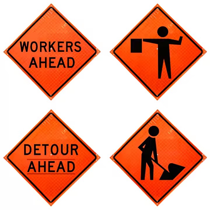
Follow the MUTCD (Manual on Uniform Traffic Control Devices) or your country’s traffic sign standards to ensure legal compliance. Non-standard signs may confuse drivers or lead to regulatory issues.
Conclusion
Designing effective guide signs requires more than just good aesthetics—it’s a strategic combination of legibility, contrast, spacing, compliance, and clarity. Whether for a public road, private campus, or commercial zone, following best practices ensures your signage communicates quickly, safely, and reliably.
Looking for professional design and manufacturing of custom guide signs? We offer fully compliant, high-visibility solutions tailored to your environment and needs.